
8.5×11 in
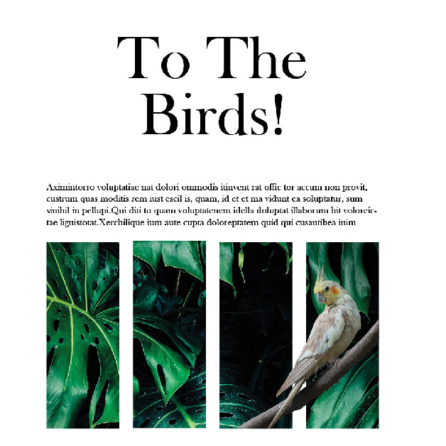
2 magazine style layouts as an introduction to typography and image layout. The ocean themed layout seeks to use images as a support and structure for text while the bird themed layout plays with the conventional shape and figure ground of images while supplementing text.

