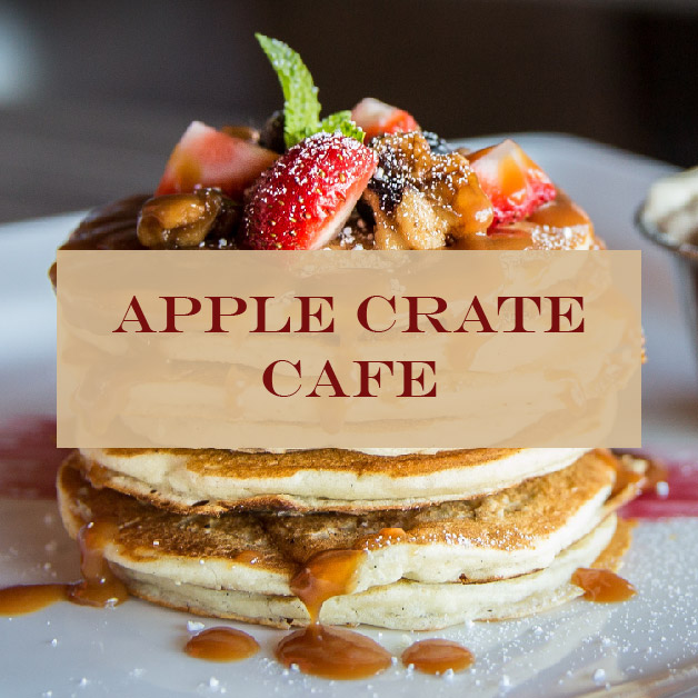
A 3-page mock website for an existing restaurant. The name content has been altered slightly. The website creates a more cohesive branding and look by using muted red and browns for a home-cooked, country feel and expectation for the food. The website features high quality images of food that fall into similar color schemes as the palette used for the nav bar and body for a cohesive look and to showcase the kind of food served. The menu page offers shortcuts to the different sections for easy navigation and allow viewers to find what they are looking for quicker.
Wireframe and mockup design

