

8.5×11 in
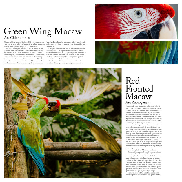
Magazine style spreads in a typography based exercise combining text and images. The layouts play with balancing text and images; some spreads are more focused on image while others concentrate on the text. Each spread is unique in layout but seeks to be cohesive with the rest of the designs.

